// SWISSTED
In advance of the new Swissted book being published next month by Quirk Books, I wanted to write a post about the Swissted project run by Mike Joyce in New York. And while we’re looking at it, I’ll also include a section on the Swiss Modernism / International Typographic Style which Swissted is inspired by. It is a design aesthetic that I absolutely love, in my mind you cannot beat a clean modernist design with a focus on typography, it never fails to draw me in.
Swissted is a blog which sees graphic designer Mike Joyce post old gig flyers which he has reworked into modernist designs. He uses geometric shapes, bold colours, a grid layout and modernist typography which is heavily influenced by the International Typographic Style created in Switzerland in the 1950s. I first saw Mike Joyce’s poster designs about a year ago and wasn’t too sure about them… I absolutely loved the designs, but I wasn’t convinced about the idea of redesigning old punk, hardcore and indie rock show flyers into new Swiss Modern posters. These are all gigs that happened and would have had their own flyers and posters, presumably in the DIY cut and paste style which punk is associated with. So I wasn’t sure that they should be redesigned, particularly not in the clean style of 1950s graphic designers such as Armin Hofmann, Josef Müller-Brockmann and Emil Ruder. I did not see them as authentic posters. However the idea of redesigning has grown on me and I now appreciate these posters as a collection of artwork which has an authenticity of its own.
Swissted is now being printed as a coffee-table book/compendium of rip-out-able posters. I’m not 100% sure that the punk and new wave bands would approve of the designs as these posters don’t really capture the essence of the punk subculture (they are too stripped back to be adopted as punk designs). However, I think Joyce has created a new identity for for these gig posters which should be recognised in its own right. I for one will definitely be purchasing.
Just to put Joyce’s work into context, there is a wider trend of redesigning artwork which is evident in the rise of the alternative film poster. Graphic designers are creating clean, sharp designs, picking up on quirky details from movies and often (but not always) using modernist typography. The Black Swan ‘teaser’ posters are an example of alternative poster art which became recognised in its own right. The limited edition, art deco-inspired posters for Darren Aronofsky’s Black Swan were released as ‘teaser’ posters before the film’s UK release, and won the team who designed them (at West London design studio La Boca) a number of awards.
// SWISS MODERNISM
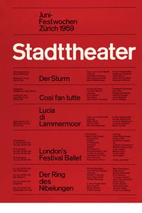
Anyone who recognises Swiss Modernism in design will know be able to tell that Mike Joyce is a big fan who adopts the same principles in his won work. Often referred to as the International Typographic Style or the International Style, the style of design that became famous in Switzerland in the 1940s and 50s was the basis of much of the development of graphic design during the mid 20th century, and the ‘rules’ of this modernist design aesthetic are still adhered to by many graphic designers today. Led by designers Josef Müller-Brockmann at the Zurich School of Arts & Krafts and Armin Hofmann at the Basel School of Design, the style favoured simplicity, legibility and objectivity. Genius.
The International style developed out of the modernist aesthetic of simplified layouts with an emphasis on text, negative space, and objective imagery. Early influences of the style include Jan Tschichold’s Die neue Typographie (1928), and Herbert Matter’s poster and brochure designs for the Swiss National Tourist Office (1934). Swiss Style also adopted Constructivist elements of geometric reduction, photomontage, and a simplified palette. Contributors to the movement aimed to create a unified international style based on clear visual communication.
There is no doubt that it has stood the test of time, however it’s not a style that everyone likes, and Swiss Modernism / International Style is not always an appropriate design choice. Swiss Modernism wedding invitation anyone? The style of graphic design you prefer totally depends on the subject and context, but as Mike Joyce has demonstrated, even punk as a visual art can be transferred into modernist poster design which actually works. Simple, clear design is quite often the best.


